Monday 12 December 2011

Pictures for magazine

I have taken various pictures for my music magazine. I have chosen a few pictures from the ones I have taken.
This one is going to be the band picture on the front cover:


I chose this one because it shows the right energy of the band. They're a "tween rock/pop" band and their poses show that they like to "rock out". On the magazine, I have cut around the edges of this picture and added a faint white glow for effect.

For my double page spread, I have chosen these pictures:

For the double page spread, I have chosen to write an interview into asking them about their music, record deals and what their plans are for next year. I decided to cut them both out from both of those pictures and put them together in one big picture. I cut out Joe on the chair and Hollie standing up from the other picture and placed them together. I did this because neither one of those pictures were working with the page and article. The finishing picture gives out a cool, chilled look with a hint of maturity in there too. This is what the picture looks like:


Tuesday 6 December 2011

6th December 2011

I have analysed a double page spread from a music magazine.
The picture and writing go over the two pages to make it clear that it's a double page spread. The layout consists of a picture on one side of the artist, trailing a bit over into the over page. The masthead is at the top on the left of the two pages which is what the audience would see first because it stands out. Below that is the actual article. 
The masthead is a quote from the article that draws the audience into reading the article. The font is attention seeking itself with letters bigger than others, making it look something other than ordinary.
The picture of the artist that the article is about is placed on the left side of the pages. The artist is leaning out like she's seeking attention with her hands on her hips/waist, wanting to stand out and be noticed which is relevant to the article.
The actual article is in columns because it makes it easier for the audience to read the story. It has a sub-heading just above the article in a slightly bigger size to the article, with the artist's name bold in red to draw in the attention of the audience to read the article and to outline who the article is about.

I have also analysed a contents page of an issue of Q magazine.
The masthead is a simple strip across the page with the Q logo and "Contents" next to it to show that this is the contents page. On the far right of the strip, it has the issue number, the date and the website address for anyone who wants to visit their website.
For the layout, the page is split into two columns, which is then further split into two parts. On the left it has the contents of the issue, which is what the audience will first see. The page numbers are in red and stand out, and there is further information into what the pages contents are. It's split into what's only in this issue and what's in every issue, every month. The every month section keeps regular buyers and attracts future buyers. On the right, it has a picture of a band from an interview so fans of this particular band would find this issue appealing and buy it. Below that is advertising what has been reviewed, with a picture relevant to it complete with what has been reviewed with page numbers. This section is helpful for buyers who want a second opinion on albums etc that they want to/are going to buy. This issue also includes an Oasis special which is located just below the "features" tab but above the "every month" tab so it's easy to see. This attracts buyers who like that band to read more about it.


Friday 18 November 2011

18th november 2011

I have analysed various front covers of music magazines.

The Q music magazine has a fairly big, recognizable masthead that stands out from the rest of the page and just under it is the slogan for the magazine. The cover artists pose and the way she's dressed shows that this issue, the target audience is men. The animals below her represent what the emphasised words are, which are "beast" and wicked". They're animals; "beast", and they're black which goes well with the word "wicked". The words on the cover goes well with the artists pose because it makes the reader want to find out more and what the article includes. The background is plain grey so the readers can focus on the picture and the various plugs. The colour scheme includes red, blue, white, grey and black. The layout of the front cover is elegant and not messy. This tells us that the age range would be from later teenagers and over, for men who find Lily Allen attractive. There are plugs at the sides and the bottom of the magazine to interest potential buyers into buying the magazine.


The RollingStone magazine has a well known masthead with it's well known font so they can place a picture on top of the font and the audience would know what magazine it is. The cover artists picture is made to seem like it's black and white picture on fire because of the story that goes with it; the destruction of the band. The picture is in black and white to represent the band as old, and they've made use of fading at the bottom of the picture just to show it's an old picture. The colour scheme includes red, orange, yellow, back, white, grey and pink for the pig. The pig is linked in with Pink Floyd- the infamous flatable pig. There is a plug to a conspiracy which shows it's not all about music, it's interested in government issues. This shows the target audience would be an older generation that have lived through the 70's because conspiracy theories and music like Pink Floyd were big in that era. There are also plugs to more articles to attract the potential buyers into buying the magazine.

Thursday 20 October 2011

20th October 2011

For my main task, we have to produce a front page, a contents page and a double page spread of a music magazine.
The magazine is going to be about unsigned bands and artists because there are already enough music magazines about bands and artists who are signed to a label and very few magazines that include unsigned bands and artists. The magazine is going to be called "Unsigned" as it states clearly what the magazine is about.
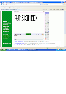
To get the font for the masthead, I went on a website called interactimage.com which lets you create your own font. http://interactimage.com/
This is the font I'm using:


Friday 14 October 2011

14th october 2011 - Preliminary completed

I have finished the Preliminary Task which was to create a front page of a school magazine and a contents page too, but to show a mock-up on the contents page. This is what my Preliminary Task looks like.


I have changed the blue colour theme on the contents page to the sort of darker yellow background colour that's on the front page. 

Tuesday 4 October 2011

4th October 2011

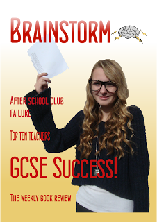
I have taken a picture of Amy holding up paper which is supposed to be her GCSE results for the front page picture.

This is the picture. I cut out Amy using Serif DrawPlus X3. I then uploaded it to the magazine.
I also changed the theme colour to a sort of yellow and have added some text.
This is what it looks like so far.


Thursday 29 September 2011

29th September 2011

I completed my contents page for the school magazine. We have to show some kind of mock-up with the contents page.